
Ripples
Sydney Hart
— Ripples examines how we understand and visualize data related to the environmental impact of global trade.
— A collaboration between artist Sydney Hart, curator Christine D'Onofrio, researcher Gavin Fridell, and the Global Reporting Centre.
— It was installed until late November, 2025, as a series of five billboards along Vancouver’s Arbutus Greenway as part of a City of Vancouver public art project.

About Ripples
Sydney Hart developed this series through discussions with Christine D'Onofrio, the GRC, and Gavin Fridell, a researcher at Saint Mary's University in Halifax whose work explores the political economy and ideological aspects of trade and trade policy.
Fridell's extensive knowledge of the impacts of international trade, and Hart's artistic approaches to data visualization, formed the basis for a creative exchange questioning how these impacts can be understood.
Ripples was installed on the unceded traditional territories of the xʷməθkʷəy̓əm (Musqueam Indian Band), Sḵwx̱wú7mesh Úxwumixw (Squamish Nation), and səlilwətaɬ (Tsleil-Waututh Nation).
The Series

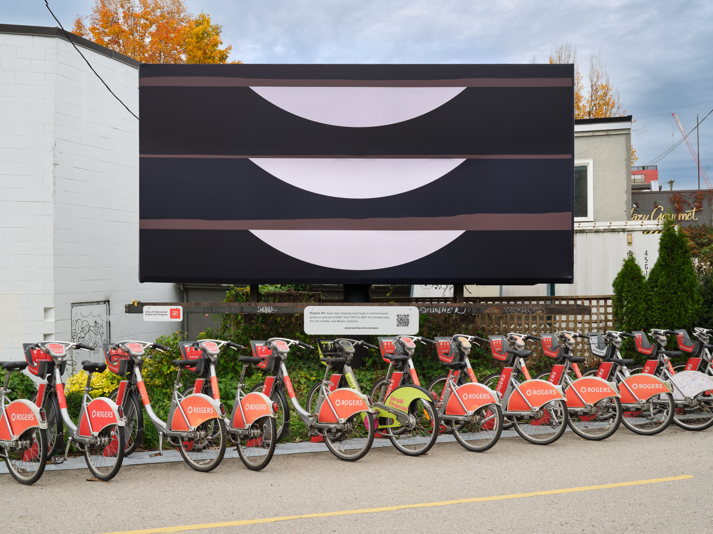
Ripples #9. Area chart showing total trade in environmental goods as percent of GDP, from 1997 to 2021, for Canada (top), the US (middle), and Mexico (bottom). Source: International Monetary Fund, Climate Change Indicators Dashboard (Trade in Environmental Goods), 2022. Satellite imagery of the Pacific Northwest (2024–2025) adapted from Planet Labs PBC.

Ripples #8. Tree map of maritime chokepoints with largest volume of crude oil and petroleum liquids transported in 2023: Strait of Malacca, Southeast Asia (brown), Strait of Hormuz, West Asia (light green), Suez Canal and SUMED Pipeline, Egypt (beige), Bab el-Mandeb, Arabian Peninsula–Horn of Africa (dark green). Source: U.S. Energy Information Administration. Satellite imagery of the Salish Sea (2025) adapted from Planet Labs PBC.

Ripples #7. Tree map of the largest flows of CO2 emissions embodied in trade for 2019: from China to "Other Asia and Pacific" (area outlined in beige), from "Other Asia and Pacific" to China (light brown), from China to the United States (green), from Canada to the United States (dark brown), and from China to "the Middle East" (orange). Source: Global Efficiency Intelligence, Embodied Carbon in Trade: Carbon Loophole report. Satellite imagery of the Pacific Northwest (2025) adapted from Planet Labs PBC.
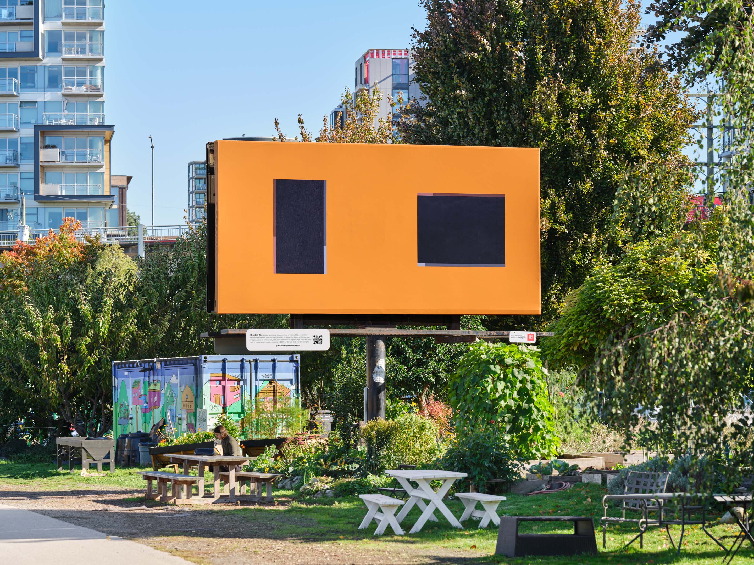
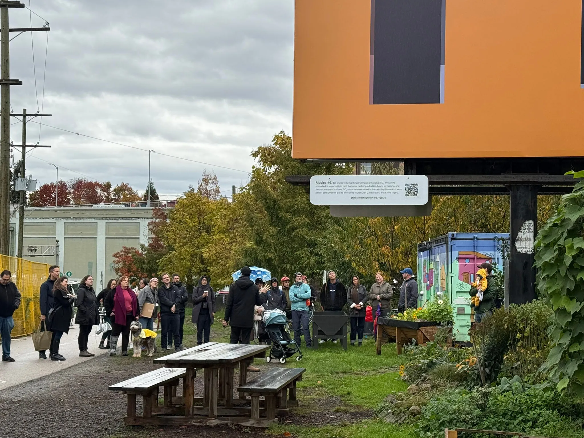
Ripples #6. Bar charts showing the percentage of national CO2 emissions embodied in exports (light red) that were part of production-based emissions, and the percentage of national CO2 emissions embodied in imports (light blue) that were part of consumption-based emissions in 2019, for Canada (left) and China (right). Source: Global Efficiency Intelligence, Embodied Carbon in Trade: Carbon Loophole report. Satellite imagery of the Salish Sea (2024) adapted from Planet Labs PBC.

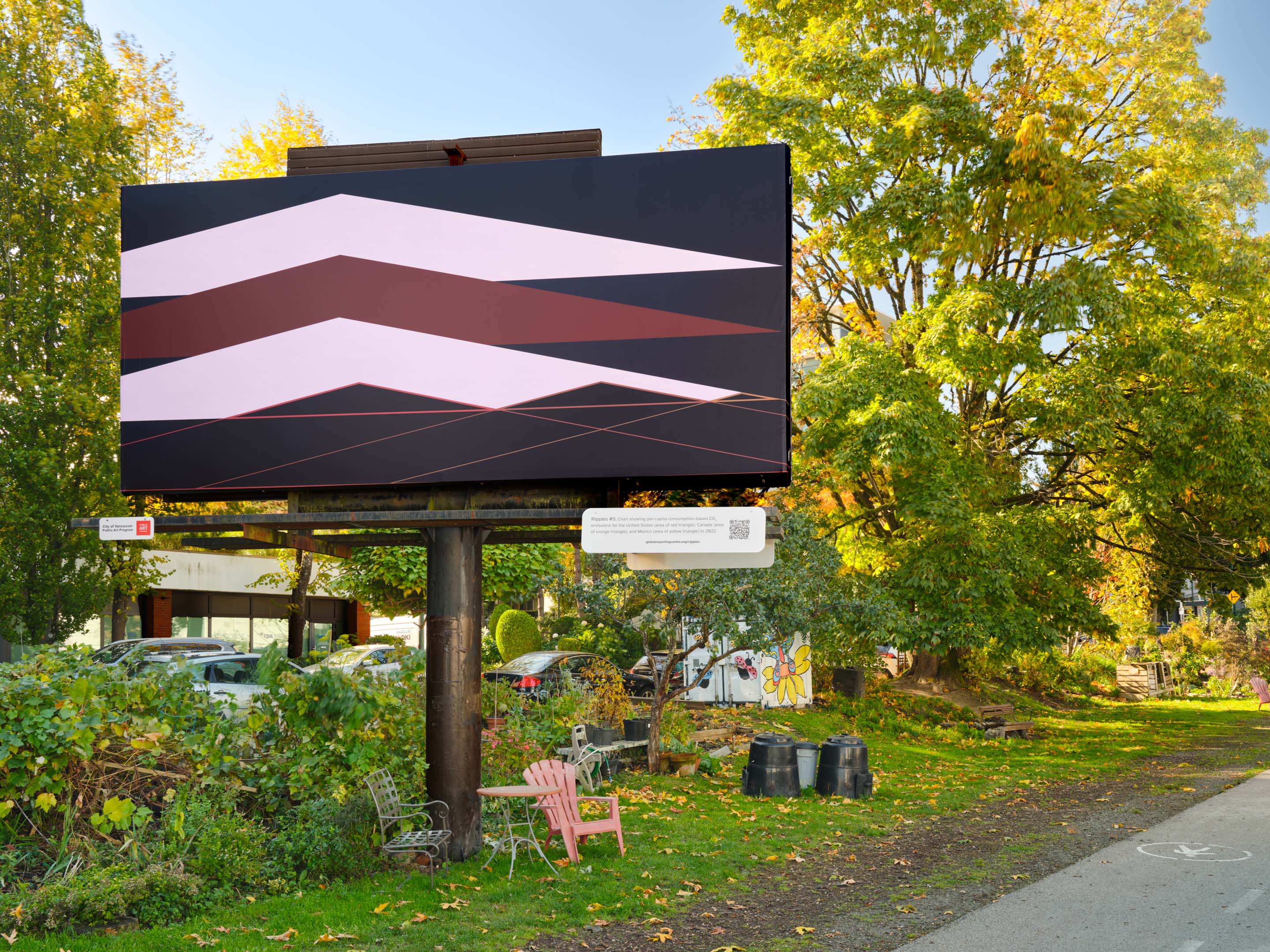
Ripples #5. Chart showing per-capita consumption-based CO2 emissions for the United States (area of red triangle), Canada (area of orange triangle), and Mexico (area of yellow triangle) in 2022. Source: Global Carbon Budget (2024) – with major processing by Our World in Data. Satellite imagery of the Pacific Northwest (2025) adapted from Planet Labs PBC.

Ripples #4. Bar chart showing CO2 emissions embedded in global trade for Asia (dark green), a net exporter of embodied CO2, and the European Union, the United Kingdom, and North America (light green), net importers of embodied CO2, in 2022. Source: Global Carbon Budget (2024) – with major processing by Our World in Data. Satellite imagery of the Salish Sea (2024) adapted from Planet Labs PBC.

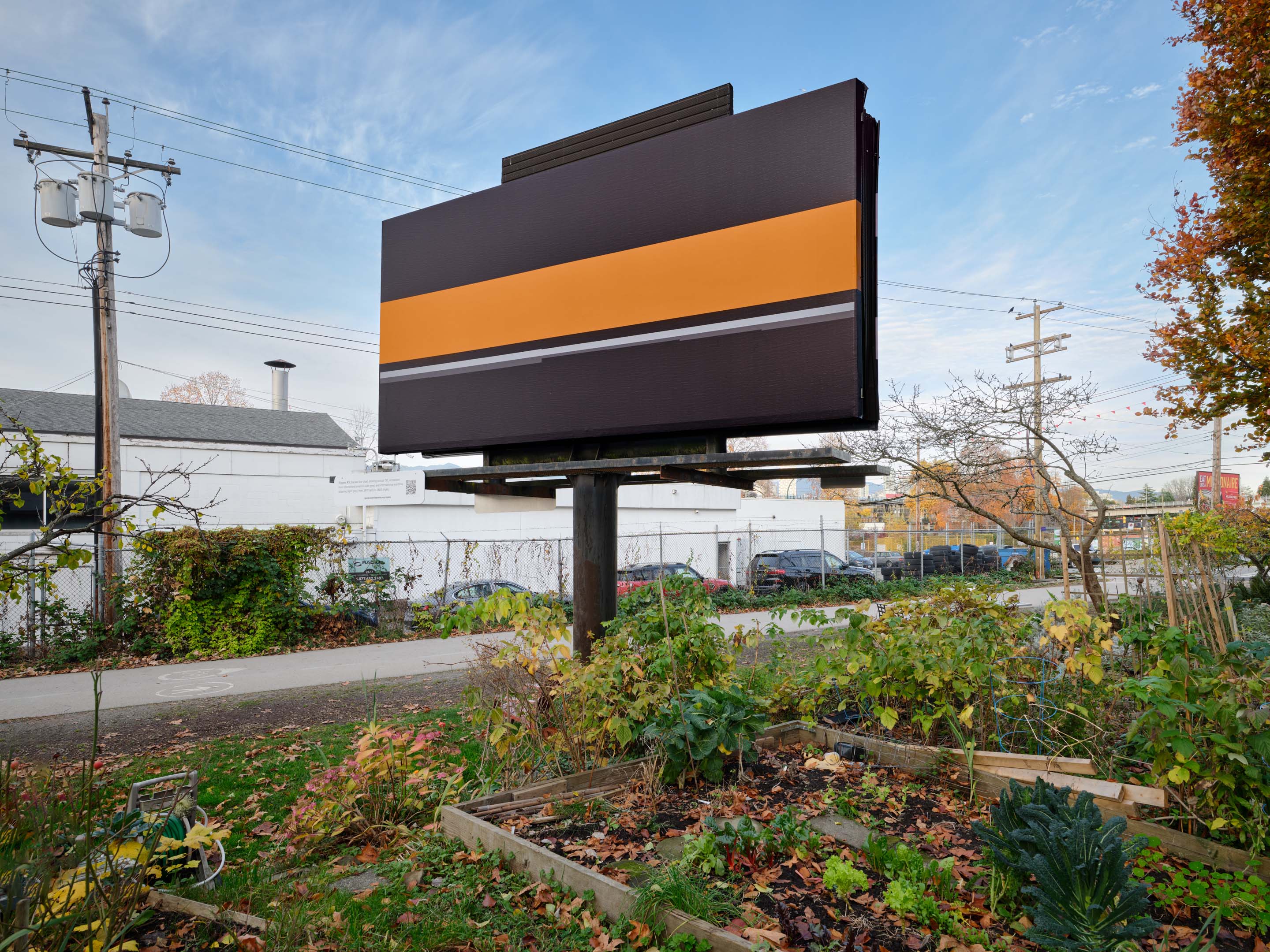
Ripples #3. Stacked bar chart showing annual CO2 emissions from international aviation (dark grey) and international maritime shipping (light grey), from 2017 (left) to 2023 (right). Source: Global Carbon Budget (2024) – with major processing by Our World in Data. Satellite imagery of the Pacific Northwest (2025) adapted from Planet Labs PBC.
Ripples #2. Bar chart of CO2 emissions embodied in international trade (green) against global CO2 emissions (orange) in 2019. Source: Global Efficiency Intelligence, Embodied Carbon in Trade: Carbon Loophole report. Satellite imagery of the Pacific Northwest (2025) adapted from Planet Labs PBC.

Ripples #1. Pie charts of consumption-based CO2 emissions in 2022 (top), 2006 (middle) and 1990 (bottom) for Asia (light grey), Europe (black), North America (dark grey), and the rest of the world (white). Source: Global Carbon Budget (2024) – with major processing by Our World in Data. Satellite imagery of the Pacific Northwest (2025) adapted from Planet Labs PBC.
Installation views
Ripples #3 on the Arbutus Greenway, Vancouver, 2025. Photo: Dennis Ha

Ripples #4 on the Arbutus Greenway, Vancouver, 2025. Photo: Dennis Ha
Ripples #5 on the Arbutus Greenway, Vancouver, 2025. Photo: Dennis Ha
Ripples #6 on the Arbutus Greenway, Vancouver, 2025. Photo: Dennis Ha
Ripples #9 on the Arbutus Greenway, Vancouver, 2025. Photo: Dennis Ha
People
 Sydney Hart is a Vancouver-based artist, art critic, and lecturer in the Faculty of Culture and Community at Emily Carr University of Art + Design.
 Christine D'Onofrio is an artist, as well as Associate Professor of Teaching, Chair of the Bachelor of Media Studies program and Director of Digital Scholarship in Arts, at the University of British Columbia.
 Gavin Fridell is a professor in Political Science and Global Development Studies at St. Mary's University and a member of the Trade and Investment Research Project (TIRP) and the Canadian Centre for Policy Alternatives (CCPA).
About the Global Reporting Centre
We are an editorially independent journalism organization based at the UBC School of Journalism, Writing, and Media. Founded in 2016, we are leaders in doing global journalism differently. We innovate industry practice, educate the next generation, and promote greater equity in journalism.
Our journalism, research, and education programs are funded through donations and grants. Every donated dollar allows our small team the time to do the rigorous research, interviewing, data gathering, editing, and fact-checking needed to seek and report the truth. Sign up for our newsletter or consider making a tax-deductible donation today.
Hidden Costs
Ripples is part of a multi-year research cluster and reporting collaboration called the Hidden Costs of Global Supply Chains. Led by the Global Reporting Centre, Hidden Costs brings together dozens of academics, journalists, and artists from around the world to reveal the consequences of global supply chains.
See more of the related research and journalistic work.
We gratefully acknowledge that this project is supported in part by funding from the Government of Canada (Social Sciences and Humanities Research Council).
