

By Peter Klein and Tamara Munzner
One of the most memorable TV commercials from the 1980s showed actress Heather Locklear extolling the virtues of Faberge Organics Shampoo. “It was so good,” she says, holding up a towel as she just got out of the shower, “I told two friends about it.” Then the screen splits to show two images of her. “And they told two friends.” Split to 4 images. “And so on, and so on, and so on.”
This commercial, spoofed by Mike Myers in the film “Wayne’s World,” was perhaps the first popular visualization of R0, a mathematical concept that, until now, had been relegated to stats classes and epidemiology papers. Put simply, the so-called “R-naught” measures how widely something contagious could spread in a susceptible population. For Locklear, the R0 (of 2, in this case) was for the marketing of over-priced soap to adoring, susceptible fans. For COVID-19, the impact is the spread of a potentially-fatal novel coronavirus in 8 billion people without any immunity.
A January report on the transmissibility of the virus estimated that the R0 is 2.6, but that number has been tough for both the public to grasp, and for data visualizers to convey. Harry Stevens, a newly-hired data visualization specialist at The Washington Post, seems to have done the best job so far. Since the actual simulation of the spread of coronavirus is exceedingly complicated – by one estimate, it would take a computer running overnight to model it – Stevens came up with a hypothetical virus called “simulitis,” working its way through a small town, and represented by bouncing dots. His goal was to show how quickly highly-communicable viruses can spread in populations without immunity, and what “social distancing” could do to help stop its spread.

“It actually mimicked reality so closely that people started to confuse these crude simulations of ‘simulitis’ with COVID-19,” Stevens said.
The article, entitled “Why outbreaks like coronavirus spread exponentially, and how to ‘flatten the curve’,” has gone viral itself, making this article reportedly the most popular piece in the newspaper’s history. It has since been translated into several languages, and has been shown and tweeted by heads of state and celebrities.
The “curve” referenced in the Post article refers to a crude line graph that shows two fates for humanity. The CDC, the Economist, and individuals have created simple visualizations based on data and charts from a 2017 paper on pandemic flu, that shows how reducing transmission of a highly-contagious virus can mean the difference between a steep rise of sick people flooding unequipped hospitals, and a more gradual spread of a virus that could, then, ultimately be contained. Fast Company has a good backstory to how the most popular of the images, by New Zealand microbiologist Siouxsie Wiles and drawn by illustrator Toby Morris, came about.

On the heels of these visualizations came stories of Italian physicians and nurses being inundated with so many COVID-19 patients, with not enough respirators, that they had to make the tough calls on who ultimately lives or dies. Reality sometimes mimics data.
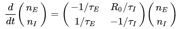
The math behind R-naught is pretty complex, utilizing so-called “compartmental models” to estimate the spread, given a number of conditions. Researchers in China have estimated the effective reproduction number of SARS-CoV-2 with the following differential equation, with the number of exposed individuals nE representing the number of people exposed and nI the number of latent infectious people:
Yeah, complicated stuff, but if you want to challenge your home-schooled highschooler, Khan Academy has a lesson on R-naught that’s pretty straightforward. And if you want to challenge yourself, check out this blog post by Christian Hubbs that models the COVID-19 curves in Python.
For those wanting to build visualizations related to COVID-19, the data viz software Tableau has a central resource for tips and tools. But it’s worth noting that no one has built a comprehensive interactive tool for real-time modeling of the pandemic – given the complexities and moving parts. The New York Times has an intriguing interactive that allows users to “play God” by moving a slider for rates of infection and fatality, and compare the projected number of American COVID-19 deaths to other fatal diseases. Ashleigh Tuite and David Fishman, epidemiology professors at the University of Toronto’s Dalla Lana School of Public Health, created an even more involved interactive, that allows users to adjust things like the R-naught, initial number of cases, and the first date of outbreak.
There have been understandable and, in some cases, justifiable alarm bells rung by some data visualization specialists, highlighting the pitfalls of representing this complex pandemic. Evan Peck, an assistant professor of computer science at Bucknell University, has a popular Twitter thread that lays out his concern that the public is sometimes confused “because designers aren’t externalizing the tradeoffs of their visual representations.” Among his concerns is that charts and graphs circulating now are based on confirmed cases, which is likely a small fraction of actual people with the virus – potentially giving the public false-confidence about the limits of this virus. Furthermore, any static visualization represents a moment in time, and with numbers changing as fast as they are, a chart could be outdated by the time it’s published. One of the perennial challenges with visualization is that audiences can see these hard-number diagrams as objective, but how one represents numbers is a matter of perspective.
Problem 3: People believe story of the vis they see.
— Evan Peck (@EvanMPeck) March 5, 2020
Over and over again, recent research has revealed that people view visualizations as objective (myself, Hidy Kong, etc.).
But look how wildly differently we’re portraying the *same* information in different news outlets… pic.twitter.com/WBNi97NggE
Kenneth Field, a cartographer in the UK, has called for responsible mapping, and presents a few problematic examples, including this bar graph of Chinese cases, which presents Hubei province, where the outbreak started, as a significant outlier:

By comparison, the other regions of China look under control, and one might be misled to think they were – which, of course, they were not.
Then there’s heat maps, which are colorful and relatively easy to make, but, as Field puts it, “just because you can doesn’t mean you should.” As the vomit-emoji below suggests, he’s concerned that geometrically-focusing such a map in a country with large provinces misrepresents the location and spread of the virus.

Amanda Makulec, a health-data visualization specialist, takes the critique one step further, suggesting that many data visualizations should be kept for public health audiences only, and not shared with the general public, given the risk of misinterpretation. She helped start the trending hashtag #vizresponsibly.
When it comes to COVID-19, we all have major responsibilities: washing hands, social distancing, self-quarantining. For those with the power of Excel, Python and Tableau at their fingertips, there’s an added burden – to help the public and policymakers understand the scope and scale of this crisis responsibly.
Tamara Munzner is a professor of computer science at the University of British Columbia and holds a PhD from Stanford. Her past visualization research spans many areas — from genomics to evolutionary biology to geometric topology to e-commerce to journalism. Her book Visualization Analysis and Design is used widely to teach data viz.
Peter Klein is a journalist and documentary filmmaker who co-produced Unseen Enemy, a film on the risks of global pandemics, and has earned two Emmy Awards for documentaries on communicable diseases. He’s the executive director of the Global Reporting Centre, and a professor of journalism at the University of British Columbia.